Adding responsive images to improve user experience
Serving the right image size for every screen keeps pages loading quickly and looking sharp, whether someone visits on a phone or a desktop.
When you plan a website, the fun parts usually come first: picking brand colors, choosing typefaces, and gathering photography. Strong visuals give a site life, turning dry paragraphs into something visitors want to browse.
Those same visuals, however, are usually the heaviest burden your website carries. According to telemetry from HTTP Archive’s State of the Web, imagery regularly accounts for nearly a megabyte of the data transferred on an average web page load—often representing the majority of total transfer weight.
At the same time, Statcounter Global Stats tracks worldwide mobile web traffic at roughly 60% of all internet browsing.
If your website delivers full-sized desktop files to phones, it forces mobile visitors to wait around while their phones choke on giant downloads. Most simply hit the back button.
Understanding what responsive images do—without needing to touch a line of code—gives you the vocabulary to make sure your site stays fast, sharp, and easy to browse.
The one-size-fits-none dilemma
Years ago, web publishing was straightforward. Almost everyone viewed the internet on desktop monitors with similar screen sizes and standard pixel grids. You could upload a single photo file, pop it into the layout, and expect it to look consistent for everyone.
Today, people land on your website through thousands of different screens:
- 4K and ultrawide office monitors
- Everyday laptops
- Tablets in landscape and portrait modes
- Pocket smartphones running high-density displays (such as Apple Retina panels or high-DPI Android screens)
If you rely on a single image file for each spot on your website, you run into an unavoidable trade-off:
- If you size the photo for large desktop screens: A 4K monitor demands a large, high-resolution file to look sharp. But when a phone visits your site, its browser has to download that entire multi-megabyte file, burn battery power, and compress the file down into a hand-held screen.
- If you size the photo for mobile screens: The file loads quickly on a phone, but turns into a blurry, pixelated mess when stretched across a laptop or computer monitor.
How responsive images solve this automatically
Responsive imaging is an automated negotiation between your visitor’s web browser and your server.
Instead of uploading a photo and forcing every device to accept that single file, a responsive website creates multiple size variations of that photo behind the scenes.
When someone clicks a link to your site, their browser tells your server what kind of screen it has and how fast its connection is. The site then delivers the exact file size that matches the device. A desktop monitor gets the wide, rich file, while a smartphone gets a lightweight file optimized for its screen dimensions.
This negotiation happens in milliseconds before the image even appears on the screen.
Two distinct jobs: resolution vs. art direction
When people talk about responsive images, they are usually dealing with two different situations:
1. Resolution switching (sharper images on small screens)
High-density phone displays have twice or three times as many pixels packed into each square inch as standard office monitors. If you send an image that only matches the phone’s physical size, it can look fuzzy.
Resolution switching provides visually identical versions of the same photo at different pixel densities. A phone receives a compact file engineered with enough density to look crisp on a high-DPI display without downloading a full desktop-sized file.
2. Art direction (keeping the story intact)
Sometimes scaling an image down does not work creatively.
Take a wide landscape photo of a couple standing on an open field. Across a wide laptop screen, the composition looks balanced, and the couple remains easy to see. Shrink that same horizontal photo down to fit the narrow width of a phone screen, and the couple becomes two tiny dots lost in the middle of a thin strip of grass.
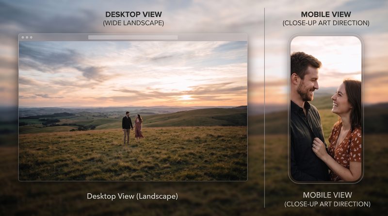
Art direction allows your site to swap the framing entirely based on the screen shape:
- Desktop view: Displays the wide, horizontal composition.
- Mobile view: Displays a vertical, closely cropped version that keeps the focus squarely on the people.
Why this matters for everyday site owners
Website speed directly influences search rankings and conversion rates. According to Google Search Central’s Core Web Vitals documentation, Google measures real-world user experience using metrics like Largest Contentful Paint (LCP).
LCP measures how long it takes for the largest visual element on the screen—which is almost always a header image or hero banner—to fully render. If that top image takes four or five seconds to load over a spotty mobile network, Google marks the page down as having a poor user experience.
Modern site builders (like WordPress, Webflow, Shopify, or Squarespace) automate much of this, but you can get better results by adopting a few practical habits:
- Upload sharp source files: Always provide your site builder with a crisp, full-size original. The software can scale down high-quality files easily, but it cannot fix a low-resolution original.
- Adopt modern image formats: Formats like WebP and AVIF compress images into much smaller files than older JPEG or PNG files with no visible loss in quality. Most contemporary website platforms convert images into these formats automatically.
- Keep logos and icons in vector format: For icons and brand logos, use SVG files. Because vector graphics rely on mathematical shapes rather than pixel grids, a single lightweight file looks sharp on any screen without needing multiple responsive versions.
- Test on an actual phone: Preview pages on mobile devices rather than just resizing your desktop browser window. Check whether your hero images crop out important details or take too long to pop up.
Visitors never complain when a page loads instantly and looks sharp. Responsive images make sure your photography does its job—drawing people in rather than driving them away.